At home in our GROUP

We are constantly evolving. New business areas, new forms of collaboration, and new challenges shape our daily lives. With our new design, we make visible what holds us together in the process: the strength of our community.

Our new design

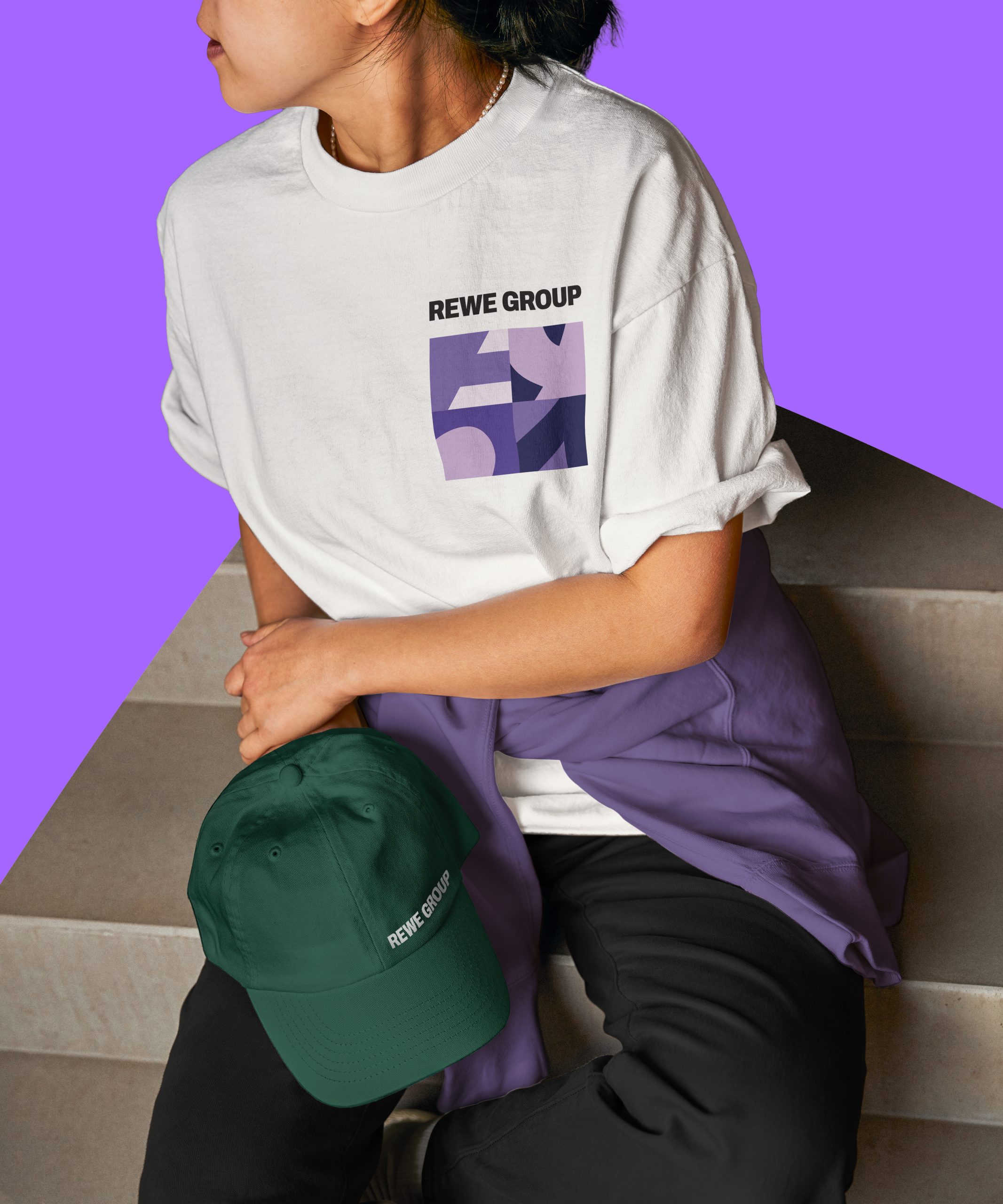
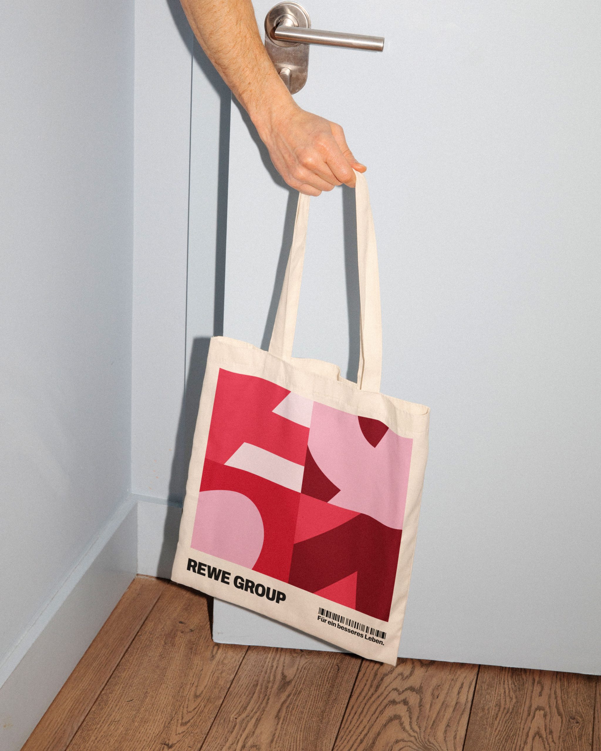
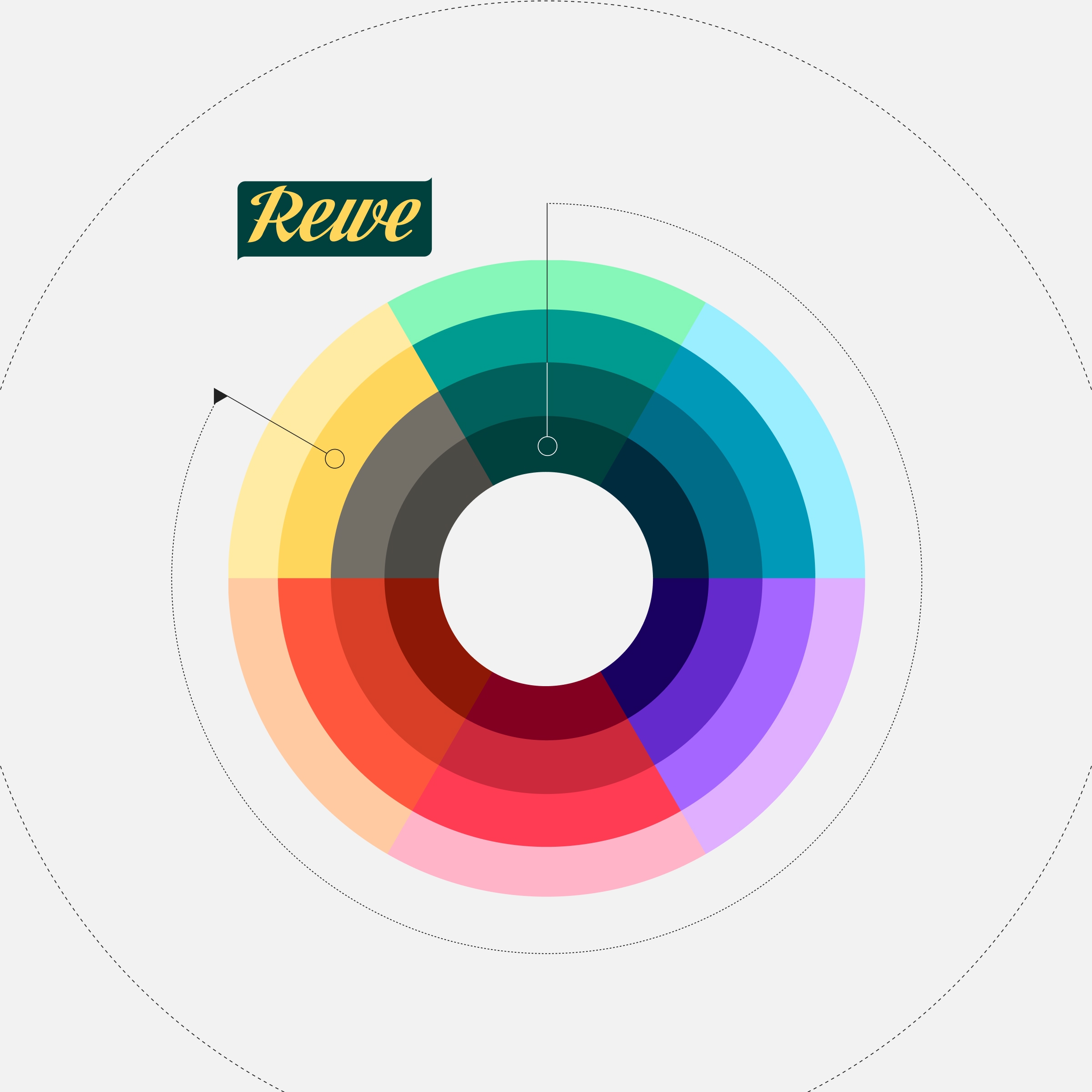
Our new design reflects what sets us apart: we are diverse, interconnected, and ready for the future. It strengthens our shared identity, ensures recognizability, and allows room for growth. Four design principles strike the right balance between diversity and consistency—turning many perspectives into a strong, unified whole.

Video

01:25

At home in our GROUP

With our new design, we make visible what holds us together: the strength of our community.

What makes our design strong

In developing our design, we focused on five key areas. These ensure we remain true to ourselves while helping us meet the demands of the future.

A sense of community is reflected in our evolved logo, which makes the strength of our network visible. Modernity and flexibility ensure our visual identity works both today and tomorrow—across all channels and for diverse requirements. With a focus on usability, we have created a design that is easy to use and enjoyable for the people who work with it every day. At the same time, our heritage remains clearly recognizable: we are building upon our strong foundation and consistently evolving it. The result is a contemporary visual identity that creates a visible, shared home across all our business areas.
Sense of community

In REWE, we all share a strong name. In the previous logo, however, the word “GROUP” took a back seat to “REWE.” In the new logo, both words now stand side by side on equal footing for the first time. This makes visible what defines us today: the strength of our community—comprising numerous colleagues and business divisions across 21 countries—achieving more together than any single part could on its own.

Design for everyday life

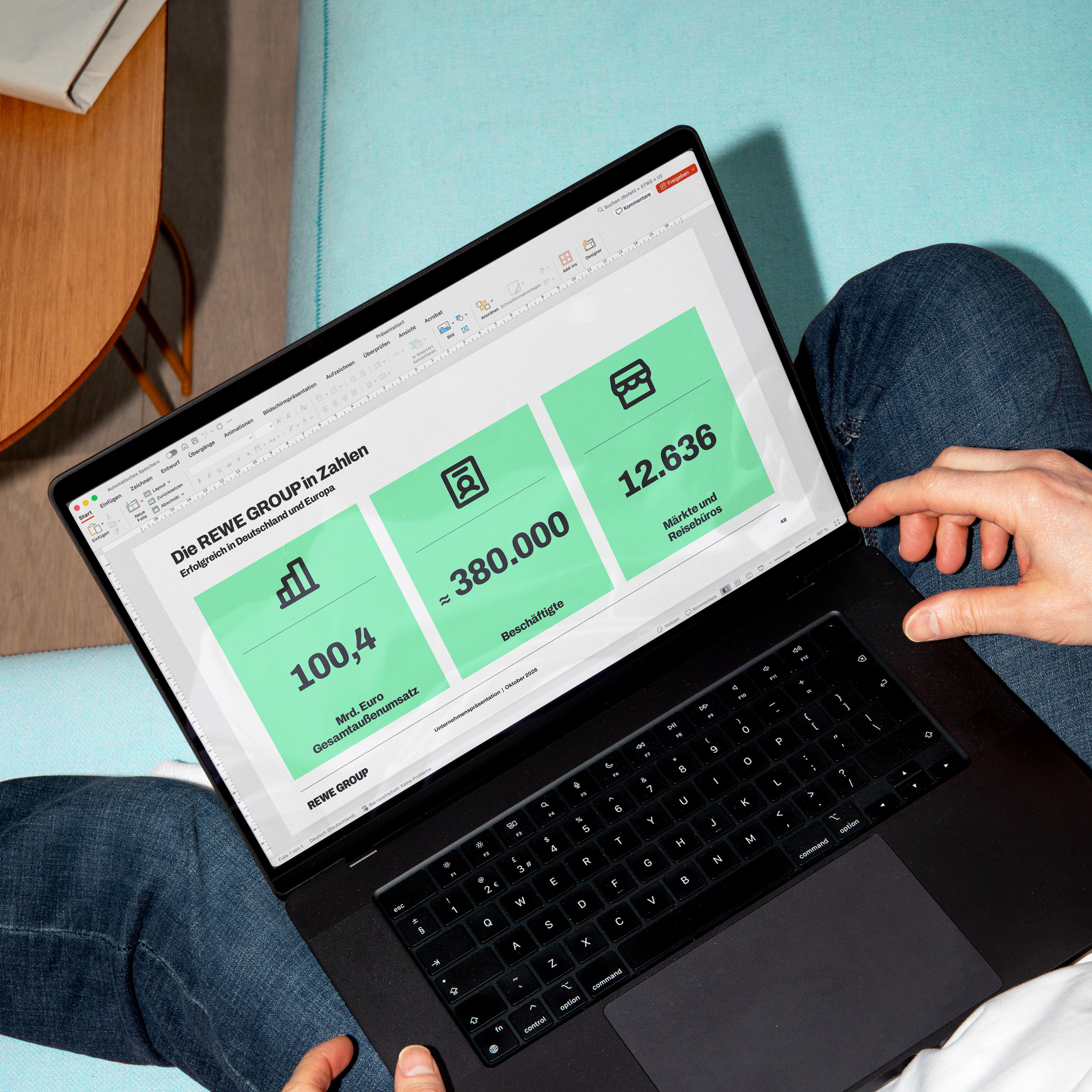
The new corporate design only comes to life through the people who use it. That is why it is designed to be enjoyable and, above all, to make daily work easier. With practical templates, versatile assets, and streamlined workflows, content can be created faster, more consistently, and with greater emotional impact—ensuring a powerful impression both internally and externally.

Our heritage

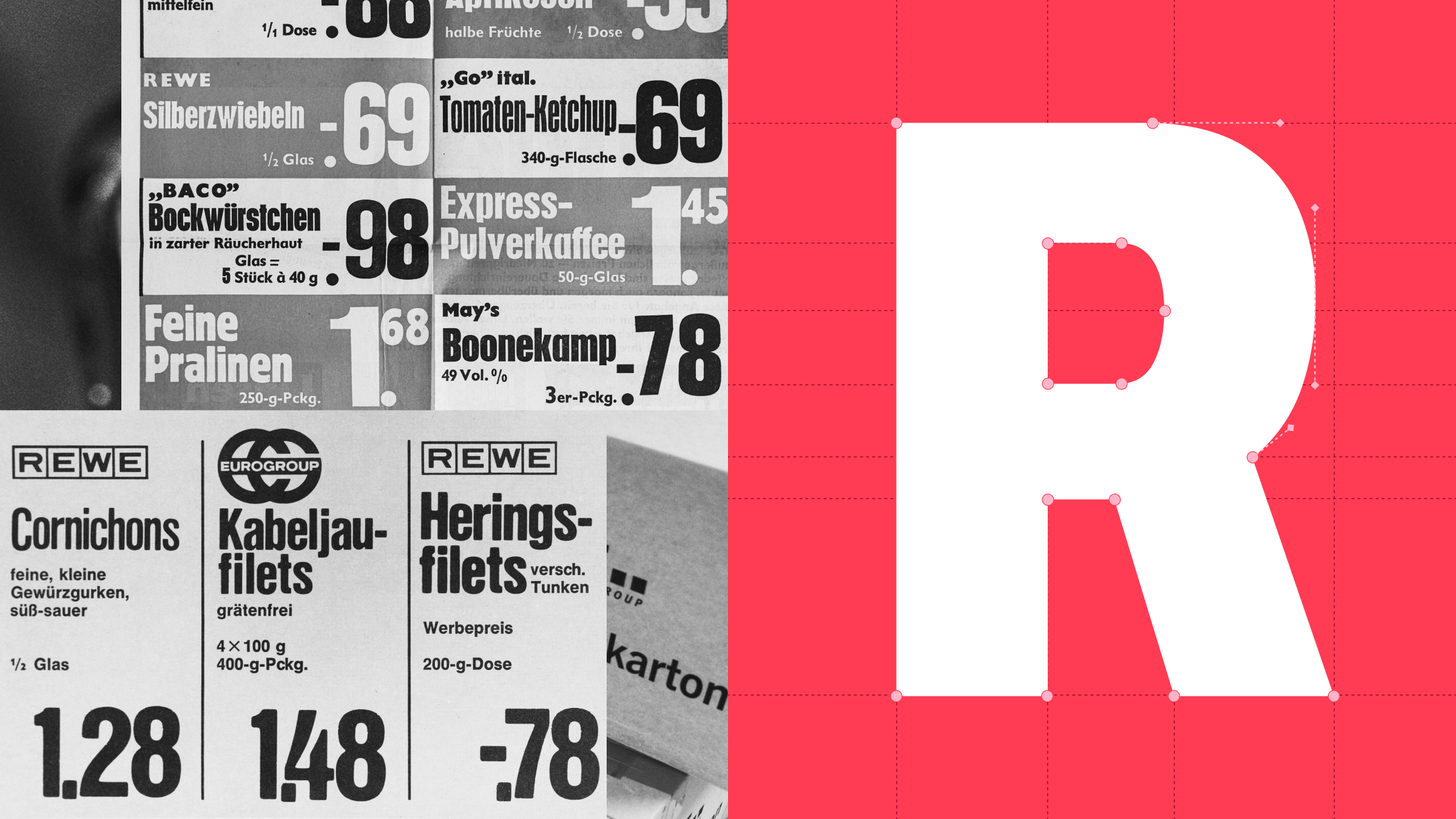
Who we are today is deeply rooted in our history. That is why we drew upon our roots for our new design. Defining elements from our historic logo live on through a modern design language, creating a distinctive identity that makes our heritage visible while simultaneously looking toward the future.

You might also be interested in this